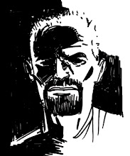
Afterglow

And here's the inked drawing from the previous post... but now in colour. I'm pretty happy with it, although I really need to learn how to do better "glow" effects. The little lights around the base of the tree just aren't looking like what I envisioned. I also need to figure out how I want to handle smoke (make it an opaque white cloud or something like what I have here). If this was for publication, I would be more of a perfectionist. But, since it is more for helping me prepare for the actual drawing of the book, I'll let it slide.
Labels: art, colour, Davis, James Powell
posted by Jason Copland at 8:53 AM
![]()
5 Comments:
I really like the color work on this. Great palette, just flat enough. (The only bit I'm not sure about is the tree, it doesn't stand out.)
Yeah, the tree is something I was playing with. The idea with the tree is that, in this near-future world that Davis lives in, things like trees in public places just don't grow. So they are created with holograms.The way I coloured this, I was trying to get the feeling of it not being of this reality.
I might need to rethink how I colour something like that...
Thanks for the comment, Ian!
Ah, then the colors make more sense.
Making something look right, when it's supposed to be wrong, is a challenge. I wonder if it might work to color some of the lines on the tree to be lighter than the tree itself, or in unexpected colors?
Yeah, I think making the tree more "unreal" is probably a better way to go. I don't want the hologram trees, and whatever else we give the hologram treatment, any sort of explanation in the book. I want people to get it on their own. So the colouring is going to have to give them more of a clue as to their nature. Something to think about...
Thanks, Ian!
for highlighting the tree you could try this: Select the area you want to “glow” (assuming you are using photoshop) use the gradient tool with white (or whatever color you want the light to be) on one end of the gradient and clear on the other end. Lower the opacity to ~10-20%. Then apply the gradient (in a new layer). When I do this I usually have to experiment with the selection size and the opacity a little till I get it right but it usually looks pretty cool.
Post a Comment
<< Home