Any Colour You Like
 click to see image bigger
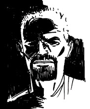
One such example of my inability to come up with a definitive color scheme is that of the Gorgon, Euryale, one of the main characters of Braids. Right from day 1, way back in 2001 when Ken and I had our first start working on Braids, I've always visualized her as green. In my brain, Euryale was green. Well, she was until I started colouring the first panel she showed up on. Suddenly, green didn't seem to fit her, it was too obvious. She needed to stand out, be different from the majority of "monsters". But not too different. She also had to be visually interesting when interacting with the other main characters. Sigh.
The above image is part of my attempt to find the right colour for her. I've narrowed it down to more of the blue/purple range, as red, yellow and orange don't really work when she is with certain other characters. Ken and I think we know the one we want. We still have to hear from James to see if we are all in agreement.
In the meantime, I'd love to know which one of the 4 hues shown above would you good people choose for our Gorgon. No answer is wrong so please leave a comment below, if you are so inclined.
Labels: art, Braids of the Gorgon, colour, James Powell, Ken faggio
posted by Jason Copland at 1:22 AM
![]()
4 Comments:
The first and fourth seem to fit in with the other colors in the palette better than the 2nd and 3rd.
But that contrast could work in your favor and make her seem other worldly...
Still I think I like the 1st one best - it seems the scariest of the four. I like the 3rd the least, that light blue is too pretty for the monster I think.
Thanks for the input, Mike!
I agree that the first is the scariest, but I also like the contrast that the second and third ones give.
I think my vote's going to be for number four though. It keeps the darkness of #1, but adds just enough color to make it more interesting visually.
I think we can all agree that #3 is out. I actually like #2 in the panels shown, but I'd be afraid that it's a little too fake/bright for the tone of the story.
I love the first one, actually. Love the darkness. She feels evil, slimy. But I'm afraid that she won't pop off the page as well as she should.
So with that, I'm thinking #4 is the way to go. She might be a bit too colorful for some scenes, but I bet you'd make it work with the imagery, and the color would let her pop and stand out.
Oh, and I can't believe I didn't get back to you on that. But in my defense, I don't remember seeing this test. :)
Post a Comment
<< Home